

Curved Image Carousel for Squarespace 7.1
Your gallery should move people —— literally.
Images ride a real 3D arc, tilting as they travel.
No coding, no developer needed.
See the curved carousel in action
Arc carousel
Images
Upload to Design → Custom Files (or any image block), then paste the address. Hover a thumbnail to preview it.
Size and speed
Spacing below zero overlaps the pictures. Height is a share of the screen, and the pictures are sized to fit it — if the row looks cut off, the code block is shorter than the animation, so drag its bottom edge down in the editor.
Curve
The pictures ride over a hill and lean with it. 0° is a flat row; below zero curves the other way, into a valley.
Appearance
Negative Reach pulls the shadow in behind the picture, so it never touches the border.
Heavier settings cannot beat the picture you uploaded — if it was small, it stays soft.
Behaviour
Save your changes
- Click Generate updated code
- Click Copy code
- Close this window (X in upper right)
- On this page, go into edit mode again, open this code block and select all (Ctrl/Cmd + A) — this deletes the existing code
- Paste the new code and Save
This is the real animation.
Get a curved image carousel animation with built-in Visual Editor for your Squarespace website
One-time payment · Instant download · Squarespace 7.1 · Core plan or higher
The curved image carousel is a single code block you paste into any Squarespace 7.1 page.
Your images sit on a curve instead of a flat line, each one tilting to follow the arc as the row drifts past. You set how deep the curve goes, how fast it moves, how round the corners are and how it behaves on mobile — all from a settings panel that opens with a gear icon over the block. Nothing is edited in code.
Squarespace gives you a grid and a slideshow. Both are fine. Both are also on ten thousand other sites — including, most likely, the one your visitor looked at just before yours.
This is the difference between a gallery people scroll past and one they stop for.
THE VISUAL EDITOR
Every setting has a slider. None of them have code. Most Squarespace code you buy asks you to find line 40, change 0.6 to 0.8, publish, look at it, change it again. This doesn't.
While you're logged into Squarespace, a small gear appears in the corner of the block. Click it and a panel opens beside your page — pictures, size and speed, the curve, the look, the behavior, with separate tabs for desktop and mobile. Drag a slider and the images change while you're dragging.
FEATURES
The curve is yours to set
One slider changes the whole character of the row. Keep it gentle and people read it as depth rather than movement. Open it up and the arc becomes the point of the section. Push it the other way and it flips — instead of riding over a hill, your images dip through a valley. And it holds its shape whether the block sits in a narrow column or stretches the full width of the screen.Phones get their own version
A picture that looks generous on a laptop can turn into a letterbox slot on a phone. So the shape, the height, the speed and the spacing each have a second setting just for mobile. Change the one that bothers you and leave the rest alone — or tell it to keep the desktop look and move on.Let the images overlap, if you want
Slide the spacing past zero and the pictures start to cover each other, so the row reads like a deck of cards being fanned rather than a line of separate images. A small switch decides which one sits on top. It makes a bigger difference than it sounds like it should.The animation stays fast
Large photos are what usually make a page slow. This one looks at how big each picture is actually being shown, and asks Squarespace for a version that size instead of downloading the full original. Anyone on a sharper screen quietly gets a sharper copy. Pictures wait until they're needed, and the whole thing stops moving while nobody's looking at it. Your visitor just gets a page that loads.It knows when to stop
Rest the cursor on it and it pauses, so people can look properly. It holds still for anyone who has asked their computer to keep things from moving. It doesn't run while it's off the screen. And you can put two of them on the same page, with different pictures and completely different settings, without either one disturbing the other.

WHAT You CAN CUSTOMIZE ─
Change everything without touching code
Your Images
Add as many as you like and move them into the order you want with a click. Each one can link somewhere — a project, a product, a booking page — and each can carry a short description for visitors using a screen reader.The shape of the images (aka Image Ratio)
Seven shapes to choose from, and the one you pick sets the tone. Tall and portrait-like for fashion and portrait photography. Perfectly square for product and lifestyle brands. Wide and cinematic for architecture, interiors and landscapes.How much room it takes
Anything from a slim band tucked between two sections to the full height of the screen, as the first thing a visitor sees.Gap between images
Wide and airy. Tight and seamless. Or overlapping, where the pictures ride over each other as they move — and a small switch decides which one sits on top.Direction and speed
Left or right, and anything from a slow drift you only notice after a moment to something with real pace. Most sites want slower than you would expect.The curve
Gentle enough to read as depth, deep enough to become the point of the section, or perfectly flat if you want the movement without the arc. It bends the other way too, so the pictures dip rather than rise.Corners
Sharp, for a clean editorial look. Or softly rounded, for wellness, lifestyle and beauty brands.Shadow
Not simply on or off. How soft it is, how dark, how far it spreads and how far it falls — so your pictures can float above the page, sit flat on it, or barely lift at all.Edges
Let the row fade out gently at the left and right instead of stopping at a hard line.Image Detail
Three levels, so you can lean toward a page that loads quickly or toward the last bit of sharpness in the photograph.Behavior
Pause when someone hovers over it. Rest while it's off the screen. Open links in a new tab. Three switches.
WHO IS THIS FOR?
Made for You & the Clients You're Building For
Photographers and portfolio websites
Let a whole series breathe across the screen instead of collapsing it into a grid of thumbnails.Interior design and architecture studios
Wide, cinematic frames that read like a printed spread rather than a wall of tiles.Fashion, beauty and product brands
Tall portrait crops in motion, so a lookbook actually feels like a lookbook.Coaches, consultants and personal brands
A moving row of faces, results …. — the section people watch instead of skim.Squarespace designers and agencies
One block that makes any client site feel custom-built, reusable on every project you take on. The Multi-site license covers all of them.
HOW TO INSTALL
(2 minutes)
Turn your website into an interactive, unforgettable experience.
Get your code
Purchase the animation and receive your code via instant download.
1
Paste the code into the code block
Open your Squarespace editor, add a Code Block to any section, and paste the code. It really is that simple.
2
Make it Yours.
Click the Gear Icon that appears over the block to upload your images and adjust the design visually.
3
AT a GLANCE

Price — $29 for one site, $69 for unlimited sites. One-time, no subscription.
Requires — Squarespace 7.1 on a Core plan or higher, because the animation uses custom JavaScript.
Works with — Fluid Engine and classic sections. Not Squarespace 7.0.
Mobile — separate height, speed, gap and aspect-ratio settings for phones.
On one page — use it as many times as you like; each copy keeps its own images and settings.
Images — any number, loaded from your Squarespace asset library.
Delivery — instant download the moment you pay.
Support — email support included with both licences.
PRICING
One Purchase. Yours Forever.
A custom-built curved carousel from a developer typically costs hundreds of dollars. For $29, you get the same effect today, plus a visual editor that most custom builds don't include.
Single Site License — $29
For website owners who want their site to feel expensive without paying agency prices.
Use the carousel anywhere on one Squarespace website, as many times as you like.
What's included:
The full code block with the visual editor
Easy copy-paste solution
Step-by-step installation guide
One Squarespace 7.1 website, unlimited pages
Yours forever — no subscription, no renewal
Email support

Images ride a real 3D arc, tilting as they travel.
No coding, no developer needed.
The animation is a copy-paste, easy-to-use solution.
Adjust images, direction, speed, ratio, height, curve, shadows, corners, spacing - all that using sliders in the Visual Editor.
Perfect for designers, coaches, photographers, agencies, service providers and all creative entrepreneurs.
What's included:
One Squarespace 7.1 website, unlimited pages
No coding skills needed
The full code block with the visual editor
Step-by-step installation guide
Yours forever — no subscription, no renewal
Email support
For personal and client use only. Resale or redistribution of the code itself is not permitted.
Multi-site License — $69
For designers and developers who want one genuinely good animation permanently in the toolkit. Use the curved carousel across every Squarespace site you own or build.
What's included:
The full code block with the visual editor
Easy copy-paste solution
Step-by-step installation guide
Unlimited Squarespace 7.1 websites, unlimited pages
Yours forever — no subscription, no renewal
Email support
Images ride a real 3D arc, tilting as they travel.
No coding, no developer needed.
The animation is a copy-paste, easy-to-use solution.
Adjust images, direction, speed, ratio, height, curve, shadows, corners, spacing - all that using sliders in the Visual Editor.
Perfect for designers, coaches, photographers, agencies, service providers and all creative entrepreneurs.
What's included:
Full animation code. Copy. Paste. Done.
No coding skills needed
Use on unlimited Squarespace 7.1 websites
Unlimited pages on every site
Yours forever — no subscriptions
Use it across as many Squarespace websites as you own or build — now and in the future. Perfect for designers and business owners managing more than one site.
For personal and client use only. Resale or redistribution of the code itself is not permitted.
Instant download. Easy copy-paste installation — no coding required.
Both licences are for personal and client use only. Resale or redistribution of the code itself is not permitted.
FAQ
Do I need to know how to code?
No. If you can copy text and paste it, you can use this. Every adjustment is made with sliders and buttons in a visual editor that opens from a gear icon over the block.
Do I need a Squarespace Business plan?
Yes. The curve is drawn frame by frame with JavaScript, and Squarespace only allows custom JavaScript on the Core and higher plans. On a Basic plan, it won't run — please check your plan before buying.
Does this work on Squarespace Fluid Engine?
Yes, and it's built for it. Drag and resize the code block anywhere on your grid. It works in classic sections too. It does not support Squarespace 7.0.
Does it work on mobile?
Yes, and mobile has its own settings rather than just shrinking. Height, speed, gap and image shape are all set separately for phones, so you can keep a tall crop on desktop and a wider one on mobile.
Can I use it more than once on the same page?
Yes. Every copy is fully independent — different images, different curve, different speed. They never interfere with each other.
Can I use this on multiple client sites?
The Single Site Licence covers one website. For client work, the Multi-site Licence at $69 covers every Squarespace site you own or build, now and in the future.
Will this slow down my website?
No. It taps into Squarespace's own content delivery network, so even a 3000px upload is served as a lightweight optimized version. Rendering pauses while the carousel is off screen, and there's no external library or plugin loading in the background.
What do I need to get started?
A Squarespace 7.1 site on a Core plan or higher, and your images uploaded. That's it. Installation takes about two minutes.
What if I get stuck?
Email me. Both licences include support, and you're emailing the person who wrote the code, not a helpdesk.
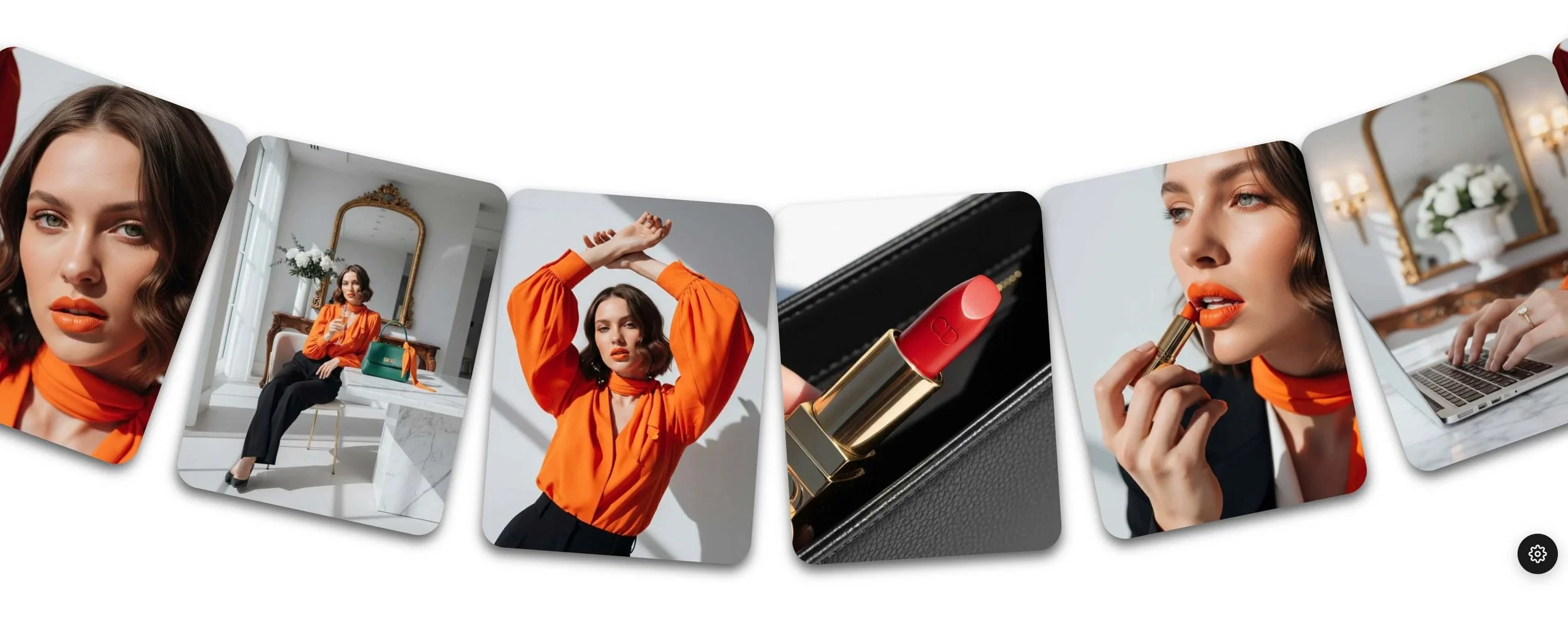
WHAT MAKES THIS ANIMATION SPECIALIt tells your visitor, in the first three seconds, that Your site was built with intention.
No plugin. No developer. No subscription. Instant download, setup guide included.